Metaphysical decorating infuses Energy into our surroundings and nourishes us. Our relationship with objects does that, but for designers, so does using geometric patterns. That’s our subject now. In Finding Energy Through Geometric Patterns, Lesson III, we will learn about making those patterns.
When we see an object, we see the object itself, of course, but we also see, subliminally, its geometric scaffolding.
The Purpose of Vision

Our visual perception system serves so many parts of us. Upon encountering a rose bush, for example, our body naturally retreats from the thorns. That same bush excites our minds because we love to categorize and learn. Another part of us, however — let’s call it the subliminal self — experiences in roses the geometric template that is behind all of nature, behind all material things. When that part of ourselves sees nature’s geometric underpinnings, we experience beauty.
The experience of beauty is the blueprint of creation. It releases a powerful jolt of energy, a joyful sense of being alive.
That exactly what we want our decorating to do.
Understanding Subliminal Geometry by Examining the Arts
Painters throughout the ages have addressed the subliminal self. They know that a magical painting requires the right subject, of course, but also the right scaffolding.
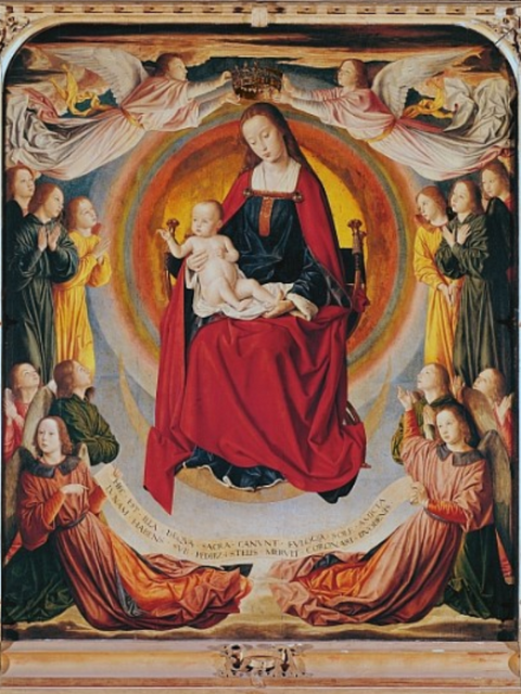
The Maitre de Moulins: Coronation of the Virgin, by Jean Hey, is an example how such artists work. The late fifteenth-century painting is undeniably beautiful and especially poignant to those who take spiritual solace in it.
More than spiritual solace is going on, however. Try to feel its subliminal blueprint, its hidden geometry.
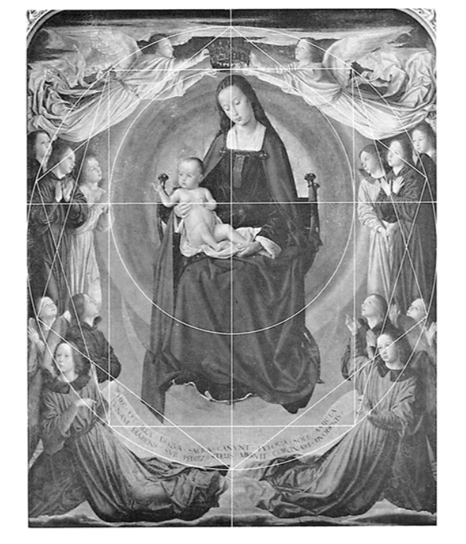
Notice that four golden rectangles divide the canvas. The painting also has two pentagons. It has many connections to the golden ratio. Two circles dominate part of it.
These patterns are part of what’s called sacred geometry. It’s incredibly energizing.
The Belief in the Power of Geometry
Sacred geometry is often misunderstood. We may hear that it’s “sacred” because it’s in churches, mosques, and temples. Actually, it’s the reverse: Artisans used sacred geometry in such places because they saw that it has the geometry of nature and believed is, thereby, inherently sacred. It certainly is inherently beautiful and powerful.

In fact, the ancients believed that this geometry was all creation’s preexisting framework-that it existed before matter was created
Such thinking can still be found among indigenous people around the world. It is common for Native Americans to start their religious ceremonies by paying homage to the sacred power of geometry as a prayer to the six directions.

The Simplest Geometric Form, the Circle
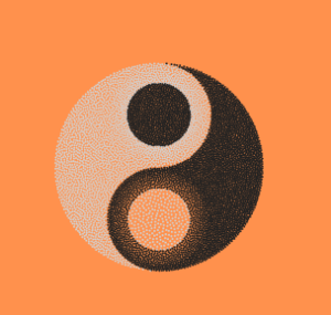
Incorporating the geometry of the Hey painting into our decorating could be daunting in its complexity. Had we been instructed as children in the mathematics of nature, art, and beauty instead of the mathematics of technology and war, we might find it easier to understand how to use geometry in our decorating. So, let’s start simply.
I will reference other geometric forms and the golden mean/ratio in the template for most life forms, but I will concentrate now on just the circle or its stretched oval. It is the easiest but most powerful geometric shape to incorporate into our decorating.
“Interestingly enough,” said Jonathan Quintin, an artist and teacher of sacred geometry, just a few mathematical principles are the basis of “the growth patterns found in nature — from molecular bonding patterns, from electrons spinning around protons, to spiral galaxies and everything in between.”
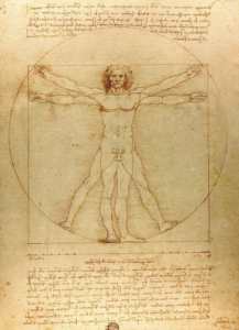
and these principles can be described geometrically through the uniform divisions of the circle and the sphere.”
Making it Simple
I mentioned in The Preface that I was taught to paint with a geometric armature in my early art classes. It was invented by the Old Professor who ran the museum and we lovingly called it The Old Professor’s Theorem. I still find it quite effective as a scaffolding for a painting because
It also leads the eye to travel in a circular path.
The Theorem
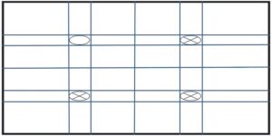
To create the Professor’s Theorem, divide a square or rectangular canvas into quarters and thirds, horizontally and vertically. Four quadrants will emerge: upper-left, upper-right, lower-left, lower right.
Placement of subject matter:
- One dominant object should be over the center of one quadrant.
- Two subdominant objects should be placed in another two quadrants.
- Most importantly, the artist should leave the one quadrant relatively empty.
On a square canvas, the eye experiences a subliminal circle. On a rectangular canvas, the eye sees a subliminal oval. both paths are pleasing to the subliminal self.
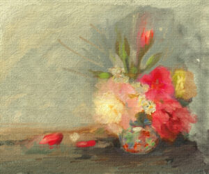
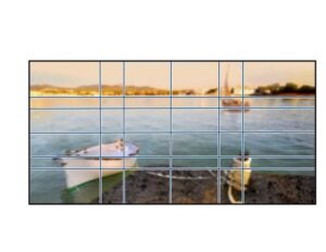
An example of a painting done in this manner follows:

Seeing the Grid in So Many Places
We need not grid this painting to see the theorem’s effectiveness. It should be obvious. The vase is dominant. The rose buds on the top right and the bottom left are subdominant. The top left is empty enough.
A Way Decorators Can Use the Theorem
Consider taking a picture of your most cluttered wall. Like this picture of a cluttered bookcase, photograph the whole wall. Grid it according to the Old Professor’s Theorem.
See the quadrants after I divided a bookcase wall.
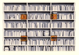
There is a problem where the quadrants end up. In this case, the two bottom quadrants make it impossible to place an object. So I made some intuitive adjustments. I decided the bottom right quadrant would be a spray of flowers, so I moved the vase lower. I just elevate the Buddha, so I moved it to the vase’s level.
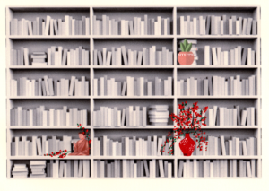
One’s eye is drawn to the dominant red cluster of flowers. It moves to connect to the two subdominant objects, and it eventually incorporates the empty space into a circle or oval.
Questions About Old Professor’s Theorem
You may wonder why a circle or oval evolves subliminally with an empty quadrant. There is a scientific reason for this. The brain processes 10 million pieces of information per second and in an attempt to deal with this overload, uses various techniques to lesson the work.
I will address other techniques later, in The Gestalt Laws of Perception, Lesson V. There is one law, however, that is good to bring up now. It is the Gestalt Law of Closure. To perceive an object and its scaffolding, the brain fills empty spaces. Remember, we see two things: the object and its background scaffolding. In this case of the boat painting, the object in the top-left quadrant is the sky. It is not totally empty because we see blue and clouds; it is relatively empty compared to the other quadrants. The relative emptiness of the quadrant compared to the other quadrants makes the brain want to close the scaffolding and in so doing a harmonious oval is perceived.
The Law of Closure is powerful and subliminally appealing. Designers of corporate logos know this. They use empty spaces to lure us. A good rule of thumb in energy decorating is to watch what big business advertising does.
.
In the forthcoming Chapter VIII, I will introduce other techniques to prompt the eye to travel in a circle. Square and rectangular rooms make up most of our environments, so we’ll discuss techniques that override such angles and make the eye circle around and come to rest. Included in these methods is my extrapolation of the Old Professors Theorem from two- to three-dimensional ideas. Each wall will have various levels of complexity.
In this way, some simple ideas can produce some profound effects.
***
There are two parts to this website, The Lessons, which are more difficult in concept and the blogs, which are lighter in nature. Consider reading The Preface, which has more information on scaffolding. The following are blogs with the same theme as Lesson III that you might enjoy:
Please note that my website allows you to leave comments at the end of the blogs but not at the end of each lesson. If you have a comment or question about a lesson, you may email me at ruta@rutas-rules.com.
