In Patterns and Symbols in Decorating, Lesson VII Part B, we will continue to look at color as a symbol and as a pattern. The subject’s complexities will be made simple with a few practical how-to’s.
When We Fail to Communicate Color Patterns
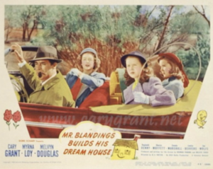
The 1948 movie “Mr. Blandings Builds His Dream House” is a great example of misunderstanding color.
In the movie, Muriel Blanding gives her contractor, Mr. PeDelford, a painfully long description of the colors she wants for each room’s walls. On the phone, Charlie the painter waits for the monologue to end.
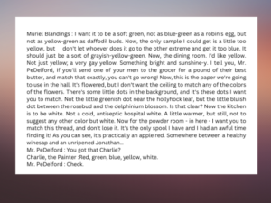
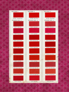
There are many different reds. Mrs. Blandings was right to use patterns found in nature to describe her wishes. (But the misogynist Mr. Pedelford wasn’t listening.)
As a symbol, the word “red” points to an infinite number of possible red patterns — “a healthy winesap” and an “unripened Jonathan” were two vivid ones.
Mrs. Blandings’ Solution
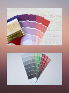
Mrs. Blandings referred to objects in the natural world. She knew not to trust color symbols. Now, I don’t suggest we take a stick of butter or a piece of thread to the fabric store to match the new draperies to the couch. That’s what paint chips are for.
Most people bring home too few paint chips. Looking for red draperies to match a couch, say, they take a few paint chips of some attractive reds home. Don’t trust your mind’s eye. You might bring home fifty strips. (When you’re done with them, don’t forget to return them to the store.)
Later in this lesson are some exercises that hone your ability to see the nuances of color. You’ll need fewer red chips.
When We Fail to Understand Color Patterns
One day we weree invited to an afternoon party at a beautiful house of on Long Island’s North Shore. The house was gorgeously decorated on the inside with the most spectacularly appointed furniture. I loved the winged-back chairs, all upholstered in elegant damasks and brocades.
Something was amiss outside, however. The owner, a friend’s Aunt Betty, remained disappointed with it, she said chatting with me later. She sought the colors of the south of France, Provence. Her house was a light brown with turquoise shutters. Certainly, one would find shutters of that color in Provence but never that particular shade of brown with a tinge of purple, making it taupe.
I explained to Betty that the houses of that part of France were painted from regional pigments. The ancient Romans mined these pigments, particularly in the limestone hills in Roussillon. Such pigments tint the buildings throughout the Mediterranean region.
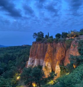
The Limestone Pigments of the Roussillon Hills
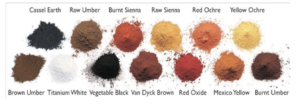
One could see the pigment layers in the cut-out hills. The powdered pigments stain everything, so we were warned to wear old clothes visiting the mines. We watched school children rolling in the dust covered head to toe in burnt sienna, burnt umber, red oxide and yellow ochre. Nowhere did we see on those school children, or in the striations in the hills, the color on Aunt Betty’s house.
Like others who look at pictorial bytes in design magazines, Betty translated what was in her mind’s eye into a symbol for light brown. The colors of the Roussillon hills have many variations, but none has a tinge of purple. To get the color she liked, she needed to pick a mathematical mixture of pigments, a pattern.
I suggested she start over with a new palette. No, she shrugged; she had already spent $50,000 painting the house. Her mind’s eye and disappointment would be enough for her.
Colors are turned into patterns all the time. Paint stores have mathematical recipes to mix them. Decorators precisely assign numbers to reflect hue, value (dark vs. light), and color purity. A paint chip or maybe a piece of a peeling house may be all Aunt Betty needed to take to prevent the costly mistake as she crossed the Atlantic. She needed a thing representing a pattern not a symbol stored in her mind, Unless it’s trained, the modern mind doesn’t see patterns in symbols. As she crossed the Pond Betty’s memory was a poor carrier of the color of her dreams.
Seeing Color Patterns — an Exercise
Symbol-mindedness is our problem. As a name, “red” is a symbol, something that doesn’t even exist in anyone’s universe. It refers to an infinite number of variations, impossible to conceive.
Here’s an exercise to start liberating our minds. Put two items we consider red beside each other. One will always appear redder than the other. Let’s keep going with a few more red objects. Each comparison has us scratching our heads. Which is the real red? Even colors coming from a prism are no help. Isolate a wavelength to determine pure redness? Another wavelength always appears redder. Redness is on a spectrum. [1]
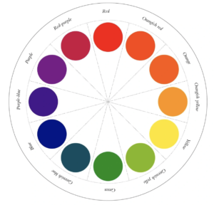
Even the red circle we can see on the color wheel is but an approximation. I can always find another object to hold next to the red on the color wheel that will look closer to real red, which is why everything red on planet Earth will either a little yellow or a little blue in it. [2]
Color Described as Pattern
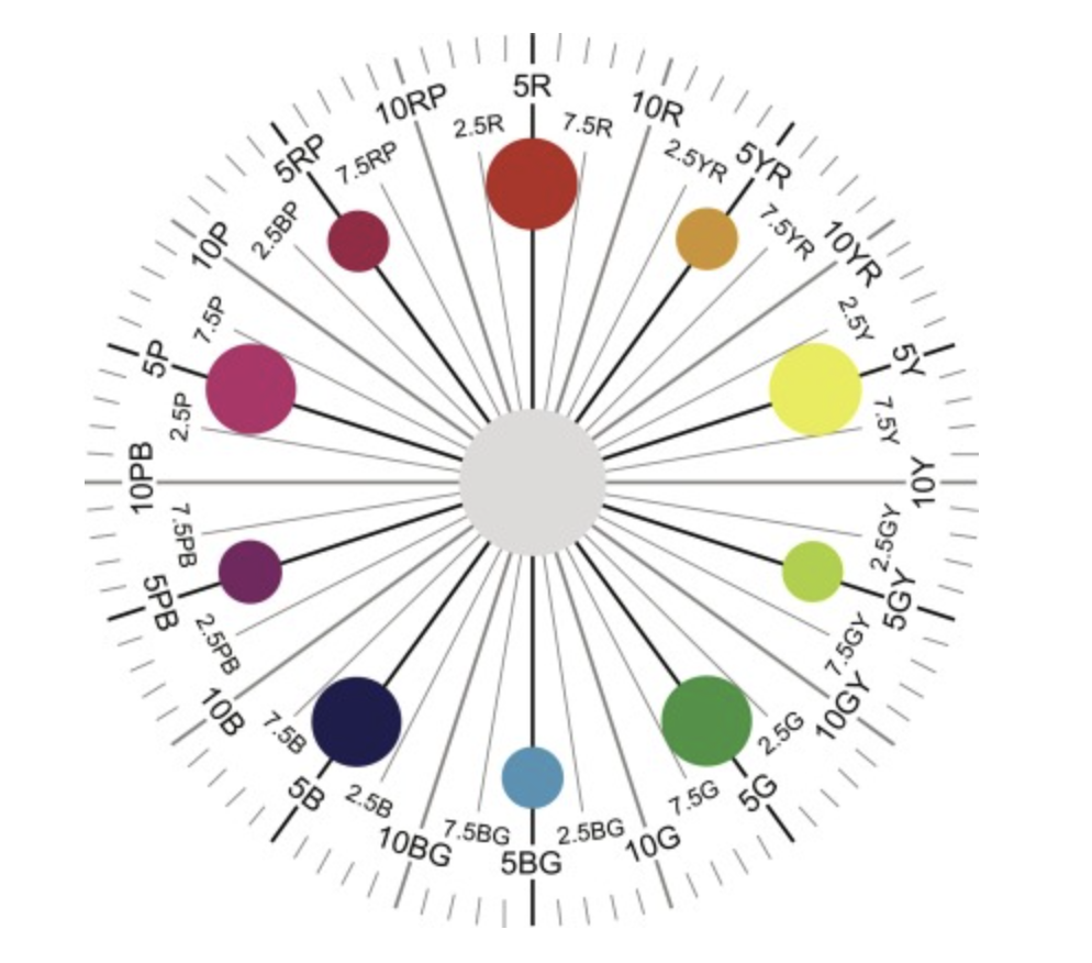
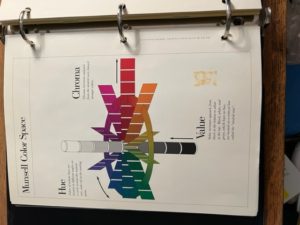
To see color as a pattern, I like to use the Munsell Color System. This color wheel is different from the grade school version, shown first above. It indicates an infinite number of reds. The idea of pure red is at 5R. As the red gets closer to red purple, the number gets lower, approaching 2.5. As the red gets closer to red orange, the number gets closer to 10. It is conceivable to see a red with the notation 4.8976R.
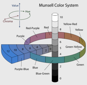
The Munsell color codes also have two other numbers for near-perfect color communication.
Let’s take 5R6/8, for example.
The first number, 5, of course, is the spot on the color wheel.
“R” is the obvious notation for red.
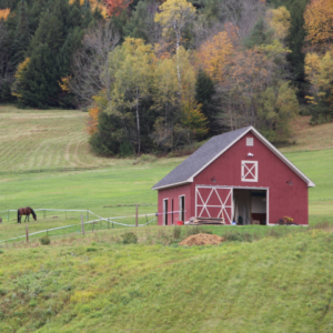
The number 6 shows the value (lightness or darkness). If that number were 8, 9 or 10, the red would appear pinkish. If the value were 3 or 4, the color would be like a barn red.
- The last number 8 refers to chroma or the color’s purity. The chroma typically range from 1-14 but can go as high as 30 for fluorescent colors. A chroma of 2 would be very gray; a chroma of 14 would be a bright, intense “pure” color.
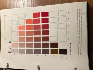
The Science of Color Patterns
Must we use the Munsell system? We do need to translate color from what we see to what we need, but, No. Often, we can use something to match colors, like a healthy winesap apple or an unripe Jonathan. Photographs or paint chips usually work, as I’ve said. We just cannot trust our mind’s eye to remember.Getting good at this, we should start seeing patterns instead of symbols.
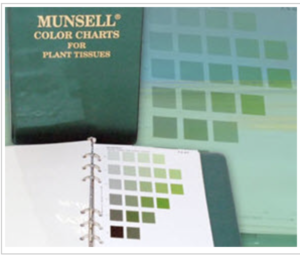
- Botanists conveying the color of a leaf would never use a symbolic word like “yellow-green,” though they might use a more scientific means of communication like 5YG5/8
- Forensic pathologists and the American National Standards Institute still widely use the system to define skin and hair colors.
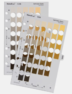
- The United States Geological Study use Munsell for matching soil colors.
- Dentist use the system in prosthodontics for selecting shades for dental restorations.
- Breweries use Munsell for matching beer colors.
- Dentist use the system in prosthodontics for selecting shades for dental restorations.
- Breweries use Munsell for matching beer colors.
Color as Pattern for Aunt Betty’s House
For the fun of it, I was able to find the Munsell color codes of the Rouissilon Hills, including some of the following pigments with their color codes:
burnt sienna – 3YR3.25/4
burnt umber – 9YR2.5/1
red oxide – 10R3/7.8
yellow ochre – 9.5YR5/8.8
These pigments were mixed with white to paint the houses throughout the Mediterranean region. So, a pigment like burnt sienna mixed with white would most likely be coded as 3YR8/4 (the 3.25 substituted by an 8 to show white has been added).
I wanted you to go through these color exercises because it will help you start seeing the patterns of the colors you want. So instead of grabbing fifty paint chips at the paint store, you might only need ten. Definitely, however, always use some item to match color in your decorating, allowing pattern not symbol to place the items for your beautiful scaffolding. Don’t let the mind/ego dictate what you use. Use your new pattern-seeking eye.
*****
[1] The wavelengths for red have different ranges depending on the source. Defined in nanometers, red is:
- 647-700 nm by CRC Handbook of Chemistry and Physics,
- 647-760 nm by Hazel Rosotti in Color, 630-700 by Edwin R. Jones in Physics 153 Class Notes
- 620-800 nm by Goerthe (Goerthe’s Theory of Colors, MIT Press).
Each seems to overlap with the other when we look at the next level of color definition, orange. The CRC handbook states that the wavelength range of orange in is 585-647nm. Goethe would have included 27 of those wavelengths as orange.
Looking at the CRC handbook of ranges from 585 to 647, can we answer what the “reddest” of the wavelengths is? If someone said it was 586, could we find that 586.5 is redder? Could we determine that 585.55 is redder still? How far can we go to find the perfect red? If we keep finding fractional components, the answer is infinity.
[2] Pigments can be a problem for artists, especially reds. Portrait painters rejoiced when Grumbacher announced in the 60s that they found a red better suited for painting a face. Prior to that, portraits were done with reds with either too much blue or too much yellow. The new red, called Grumbacher Red, was a huge improvement.
*****
There are two parts to this website, The Lessons, which are more difficult in concept, and the blogs, which are lighter in nature. A blog that you might enjoy with the same theme as Patterns and Symbols in Decorating, Lesson VII, Part B is:
A lesson that relates to this lesson is:
Please note that my website allows you to leave comments at the end of the blogs but not at the end of each lesson. If you have a comment or question about a lesson, you may email me at ruta@rutas-rules.com
