Knowing the scientific Gestalt Laws of Perception helps us create harmonious, Energetic spaces. Such knowledge not only helps in arranging the furniture and picking out colors of rugs and fabric but also attending to the geometric scaffolding that is a major part of metaphysical design.
.
Gestalt Laws of Organization
Law of Pragranz
The Law of Pragnanz is the most important of the Gestalt laws. It is also known as the Law of Good Figure and the Law of Simplicity. It says that when the brain senses a set of ambiguous objects, it renders them as simply as it can. Thanks to the Law of Pragnanz, we perceive every stimulus pattern as less complicated that it is.
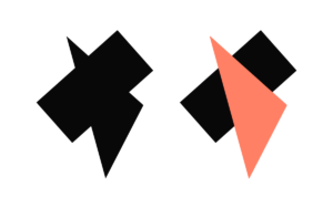
Example: The figure on the left is a complex, eleven-sided polygon, but you probably don’t see it that way. Your brain instantly presents to you a triangle overlapping a rectangle. It’s the simplest visual explanation the brain can find.
Message for decorators:
“The eye” looks for the simplest, least complicated view. Clutter stresses us. Less clutter is calming. Minimalism enables us to create harmonious scaffoldings.
In reality, though, minimalism is a stretch for most of us. We live or work in small studios, own and manage many objects, and deal with the infinite paraphernalia of daily life. In later lessons, we’ll see ways to trick the eye into perceiving simplicity.
*****
Law of Similarity
The Law of Similarity says that similar things appear grouped together. Groupings can be formed from any visual similarity, such as lightness, orientation, size, height, texture, and especially color. It can be a perfect tool in decorating. The tool reaches across wide spaces, though. As we’ll see, other Gestalt laws sometimes trump it.
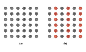
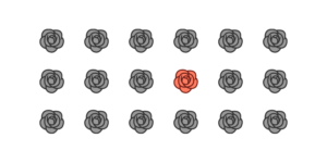
Example: In figure (a), we perceive the diagram as vertical and horizontal rows of flowers. Because of the Law of Similarity, we perceive figure (b) as vertical columns of alternating red and gray flowers. The law says we perceive similar things together.
Message for decorators:
The brain groups similar things together. Placing like things in different parts of a room makes the eye jump from an item to other similar ones. Properly placed, the objects can get the eye to reveal geometric scaffolding that excites the part of us that engenders beauty.
Among similar items, color stands out more than anything else about them. Decorators commonly make two color mistakes:
- They fail to use a color that dominates.[2] Such a failure may disappoint the part of us that seeks patterns. The eye struggles to find a pattern and can’t.
- They use too many colors. Then, the eye works overtime bouncing all over the place. Instead of moving in a circle or other satisfying pattern, the eye experiences the subliminal scaffolding of a three-year-old with an Etch-a-Sketch.
*****
Law of Proximity
The Law of Proximity, also known as the Law of Nearness, says that things near each other appear grouped. Placing objects together will cause the eye to see all these objects as one thing (one fixation).
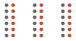
You should see three groups of flowers due to the Law of Proximity. The nearness of the flowers is stronger than the color similarity. Proximity is a strong law and can topple similarity.
Message for decorators:
Remember that what appears as a form composed of details can become the detail of another form. The fixations create a form that might become just the fixation of a larger form.
Consider everything in your visual field as a detail or a form that depends on its relationship with other objects. A sense of minimalism occurs as we take the details (fixations) we see and make them appear as a detail or fixation of a larger form. We need not move many things to increase serenity. We need only move some to appear closer to each other. The Law of Proximity is a good starting point.
.
*****
The Law of Common Region
The Law of Common Region states that we perceive things grouped in a closed region as belonging to a single group. Creating a clear boundary around a group of objects (fixations) gathers them as one fixation. The law, also called the Law of Uniform Connectedness and Law of Unity, is like the Law of Proximity, but a border strengthens it.
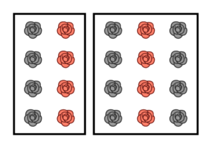
The roses are near other objects alike in color and shape, but adding borders or other barriers makes the two groups appear as one group (one fixation) each.
Message for decorators:
The Law of Common Region can unify a group of details that otherwise appear unconnected and visually noisy. A recent online tip from Real Simple reflects on this law. A cluttered kitchen counter where keys, mail, broken objects, and other paraphernalia land can appear clutter-free, Real Simple suggests, by placing them on a tray. The details (fixations) of clutter on a tray is seen in one form (one fixation). If the tray becomes a detail in the kitchen, it may need to be addressed. But, the surface, at least, is perceived calmer.
Consider using trays to corral framed photos scattered on a desk or table, spice and condiment bottles near the kitchen stove, or toiletry bottles near the bathroom sink. We can further diminish the cognitive load by making the items on the tray look similar. Consider framing the various photos on the tray with the same color or same type of bottles or jars in the kitchen or bathroom. Now we have engaged the Law of Simplicity along with the Law of Common Region.
******
The Law of Closure
The Law of Closure states that the brain will try to make a coherent pattern treat incomplete or fragmented patterns into something complete. When the brain processes a complex arrangement of visual items, it seeks to form them into a single recognizable pattern.
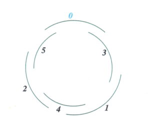
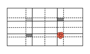
The Old Professor’s Theorem used the Law of Closure. There was one dominant spot, two subdominant spots and one left empty. The brain, seeing the rose as the focal point would then seek other subdominant items. Operating under the Law of Continuity. it would close the spot as a circle. Closing a form pleases the subliminal self. We’ll use this theorem later to decorate a wall or room.
“Closure is dangerous, volatile, seductive, hypnotic and even playful,” wrote the philosopher V. K. Maheshwari. “It works to show us an image that does not actually exist before our eyes; it reaches into our experience and into our psyche to create a fiction and compels us to believe it.” [3]
Advertisers know how pleasing the law of closure is. Here are corporate logos using the law.

Message for decorators:
Allow empty space to create Energetic design. When the Victorian Age emerged in the mid-1800s, a new way of decorating emerged. Often called the Victorian style, it is really the use of an overabundance of styles. The Industrial Revolution fueled this nightmare because goods were then cheap and plentiful. The result was to accumulate as much as possible and fill every nook and cranny with items of conspicuous consumption.
Much has been written about Victorian interior design, but the best description is given by the Italian critic Mario Praz. He described the Victorian design movement as one of having “horror vacui” or fear of open spaces.
Filling up all the spaces, create a symbolic fake abundance. Leaving some space allows for Energetic geometry to take over.
The atmosphere in this environment was suffocating. If one were to draw the connections of the multiple eye fixations, it would look like a rapid ping-pong game.
.
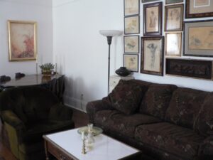
Leaving some spaces empty is essential to decorating harmoniously. We need to leave something for the brain to experience the pleasure of closing.
*****
The Law of Good Continuity
The Law of Continuity, or the Law of Good Continuation, says that the brain chooses, when it can, to connect individual things in a smooth, continuous flow. It will try to see them belonging together in straight or curving rows.
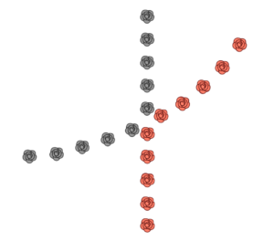
Example: The eye follows the series of black and red flowers along the curve and the series of points along the straight line. The eye is less likely to follow similar colors. The Law of Continuity trumps the Law of Similarity. It prefers smooth changes over abrupt changes.
Message for decorators:
“The eye” wants to see continuity and a smooth transition of points. Conversely, a jagged line, when imposed on the human organism, is tedious and disconcerting for the human perception system. When the decorator places similar things throughout the room that follows what “the eye” wants to see, a smooth path, the external world corresponds to the internal needs of the subliminal self, resulting in visual harmony.
*****
The Principle of Focal Point
A focal point is a point of interest, emphasis, or difference. The principle says that focal points capture and hold the eye’s attention. It tells the eye where to start creating the scaffolding. From there, our attention flows to other parts of the design.
Message for decorators:
Creating a focal point in our decorating grabs attention and allows our eye to start the search for subliminal geometric forms
*****
Think Small and Big
The eye travels along a set of limited fixations to perceive an object. It seeks simplicity, similarity, continuity, and wholeness. Complications, a lack of connection, and a jagged path stress it. The Gestalt scientific principles of perception explains it.
Words associated with visual perception and aesthetics and often interchangeable. For practical purposes, we can think small and big. Words referring to relative smallness include sensation, fixation, pixel, ornament, dot, element, and detail. Words whose references are larger include form, thing, object, painting, interior, exterior, element, room, building.
Remember that the “big” can become the small “fixation” of something larger. As our eyes travel to each fixation, a geometric pattern is formed. When we don’t pay attention to the pattern, we tend to experience it subliminally.
Back to Metaphysics
The point of metaphysical decorating is to get Energy into our environment. It’s not a scientific idea, but it’s one we can borrow from the Gestalt research. Organizing stimuli to create a smooth path, reducing stimuli and cognitive load, and setting up our objects to become fixations can create templates based on nature, producing the Energy we crave. Many geometric blueprints are based on nature. The easiest blueprint to use, my favorite, is circular. It reveals subliminal circles and ovals as the scaffolding.
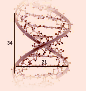
Still, another pattern gives us a good idea how and why we can release Energy through decorating. That pattern is the Golden Proportion. Returning to the scaffolding of the rose, we can see that the rose petal structure follows the Golden Mean. That proportion is 1 to 1.618.
For details on that proportion, see the blog, Understanding the Golden Proportion.
Compare the pictures of the rose and our DNA. They look different, but because of the same mathematical underpinnings, they are alike.
The scaffolding of the rose has the same mathematical underpinnings as our DNA, the Golden Ratio. We are looking at ourselves when we look at a rose. Likewise, the structure of our DNA is the same as the Milky Way Galaxy. Our eye lashes are equal via the mathematical underpinnings to the curve of a wave, which is why good designers seek out the mathematical structure behind nature and try to duplicate it in their art.
Looking at the scaffolding of the rose is looking at the mathematics of creation. That is the source of Energy.
These geometric forms and mathematical underpinnings are powerful. A Time Magazine article revealed that nature lowers blood pressure, increases creativity, promotes cancer-fighting cells, helps address ADHD as well as depression and anxiety. Even looking at trees or a plant out a window has an effect. Most significantly for designers, an artificial image works that way.
What about the similarity between a real tree or poster of one, or a real potted plant or a silk reproduction? Perhaps reproductions stimulate the brain to create the same positive biochemical reactions that the live objects do. Or another answer? Perhaps the healing forces are the mathematical underpinning of the geometry that is the scaffolding of both
Can geometry heal? I believe it can.
I believe the subliminal self is searching for itself when it scans the details (or fixations) to arrive at form (or the object). In scanning, the eye moves in patterns. When that pattern corresponds with nature’s patterns, the self recognizes the patterns of creation. In essence, it recognizes itself. The eye is not just a machine, but a scavenger of meaning. The ego is looking for the object, but the subliminal self is looking for the mathematics of nature; in essence, looking for a mirror of the self.
A wonderful thing takes place as such profundity happens. The self receives a tremendous jolt of Energy. Sometimes we call it chi; sometimes beauty. It is powerful.
When the self finds these patterns of nature, it moves like a dance. For that reason, one of the ways to decorate for Energy, harmony, and happiness is to give the eye a chance to experience a beautiful movement—to let the eyes have a delightful dance.
***
There are two parts to this website, The Lessons which are more difficult in concept and the blogs which are lighter in nature. Blogs that you might enjoy which have the same theme as Lesson Four are:
Please note that my website allows you to leave comments at the end of the blogs but not at the end of each lesson. If you have a comment or question about a lesson, you may email me at ruta@rutas-rules.com
***
[1] E. Bruce Goldstein. Sensation and Perception, Third Edition. Wadsworth Publishing Company. Belmont, California. 1980.
[2] In esoteric and mainstream books on color, a great deal of attention is given to the “energy” of color. In this book, color is treated only as a sensation that leads the eye to form a certain scaffolding.
[3] Dr. V.K.Maheshwari, M.A(Socio, Phil) B.Sc. M. Ed, Ph.D. Gestalt Theory – The Insight Learning. January 27, 2015.
