The eyes are not just machines to help us to see but spiritual scavengers for our souls. They are constantly moving to glean information. Aside from identifying things in their visual path, they are always looking for the geometric patterns that make up the blueprints of nature. When found, there is a jolt of Energy. I often think of the movements of the eyes as a dance, especially when they are delighted by natural patterns. In Let the Eyes Have a Most Pleasurable Dance, Lesson VII, Part A, we will explore how our decorating can set the stage to please the eye and bring Energy into our environment.
The Rules of Design for Energy
In the 1700’s the rules of design changed and with that change we started to lose the ability to design for Energy. You have heard the saying “Beauty is in the eye of the beholder.” This was a saying to support the philosophy of David Hume who believed that “Beauty in things exists merely in the mind which contemplates them.” This meant that there were no rules.
The ancients Greek philosopher, Plato believed just the opposite, that is that good design had rules and could not be made up by man. Those rules were based on the geometry found in nature. (We will examine his philosophy more fully in Lesson IX, Towards a Philosophy of Decorating, Part A.)
The good news is that even though there are rules, there are an infinite amount of ways to express them. We just have to be careful not to step outside of the boundaries set by these laws. By limiting ourselves to a set of decorating rules, we open up the power of energetic creating. The epigram attributed to Pythagoras that the “limit gives form to the limitless” sums it up. Allow yourself to be limited by the rules and you will be rewarded by the power of Energy.
The golden proportion is the most used geometric blueprint found in nature. Its infinite permutations of patterns is a good decorating tool but it is difficult to employ. At some later date I will explore those possibilities but for now I want to introduce a simpler scaffolding which is considered the highest pattern of sacred geometry. In your environments, I want you to get your eye to move in a circular path.
Circling the Square
We live and work in square or rectangular environments but our inner selves are more circular in nature. Aniela Jaffre who wrote Part Four of Jung’s Man and His Symbols said “The circle is a symbol of the psyche (even Plato described the psyche as a sphere). The square (and often the rectangle) is a symbol of earthbound matter, of the body and reality.” In sacred geometry, the square is a symbol for the earth. The circle is the symbol for the heavens. So with all these squares and rectangles around us, getting the eye to move in a circular manner can only help to give us more Energy.
You might have heard the phrase, ‘squaring the circle.” It refers to attempts to construct a square with the area of a given circle using only a compass and a straight edge. Medieval intellectualists had no video games. To pass a Sunday afternoon after church services, they played mathematical puzzles.
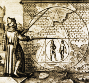
“Squaring the circle” was one of them. Attempts to do so resulted in nothing and in 1882, it was proven that this was not possible to do. Today “squaring a circle” is a metaphor for trying to do the impossible.
My term “circling the square” is not a mathematical puzzle but a way to get the eyes to move in a circular manner in an environment filled with 90 degree corners and angles. I have several methods for doing this. Used alone or in combination, these methods bring a great deal of calm and Energy to the environment.
Searching for Like Thinking
In the thirty-five years of actively putting all my theories together, I searched for ideas similar to my thinking. Part of the search was my need to calm my own insecurities about writing about such unusual ideas.
Along the way, I found the writings of the very talented interior designer, Vicki Posey of The Legacy Design Group. Aside from her work as an interior designer and CEO of a large interior design company, she wrote a monthly blog on her website to teach design concepts.
In one of her blogs, she wrote: “I have often said that the successful room is one where, upon entry, one’s eye sweeps the room and comes to rest. That if the eye does not “come to rest, the design is not successful. The principles and elements of design have not been successfully incorporated and the room will not function as well as it should and one will have a sense of “dis”ease when present.”
I thought to myself that “sweeping the room and coming to rest” is the essence of circling the square except that her idea had the eye stopping as a sign of success.
I asked her where she got that concept. Since she taught interior design early in her career, she thought that it was part of some text of interior design. I told her that I never saw this concept in print. Upon some research, she wrote back:
“In reviewing my textbooks, I believe you are correct – I do not find my statement in print – I would have to agree that it is something that came to me instinctively – although I hadn’t really thought much about it. I can’t remember when I started using the phrase, only that it has been a part of my teaching and philosophy for many (many!) years.”
My Methods of Bringing Circular Eye Movements in Decorating
Like Vicki Posey, sometimes design techniques come from deep inside of us. They are not taught in textbooks but are intuitive. They are proven in the laboratory of ones own personal experience. Please find my intuitive methods of bringing Energy to your environments through the use of circular geometry and eye movements.
1. Circling the Square by Using the Old Professor’s Theorem
In Finding Energy Through Geometric Patterns, Lesson III, I wrote about the Old Professors Theorem for creating a scaffolding on a canvas. He instinctively developed a theory for a canvas.
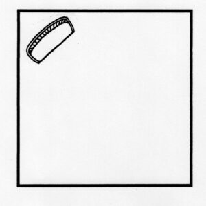
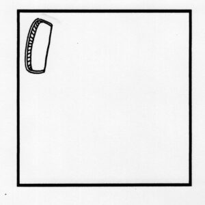
Review the theorem for a canvas. Of the four quadrants, one must be dominant, two must be subdominant and one submissive or empty. This made the eye travel in a circle or ellipse. The absence of detail in one of the quadrants is key to the movement. Similar to the process of reading, not every point of the object must be fixated by the eye; the brain interprets the closure. (See Law of Closure in The Gestalt Laws of Perception, Lesson V.) If one were to put equally detailed objects in all four quadrants the eye could be jumping all around. This kind of eye stress is often called visual noise and is the opposite of visual harmony.
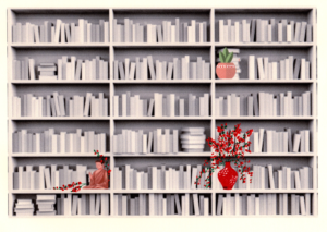
I sometimes use this theorem to arrange objects on one wall like the bookcase in Lesson III.
2. Circling the Square by Using the Old Professor’s Theorem in Three Dimensions
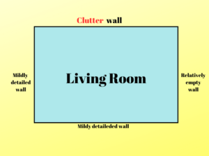
I extrapolated that if it could work on a canvas, it could work in a room. The translation from 2D to 3D is simple. Instead of four quadrants, think of four walls. I allowed one wall to be a heavily detailed and dominant with all the objects like knickknacks, clutter and small detailed objects. Two walls could have some objects, but by comparison were to be subdued. The fourth wall had to be relatively bare.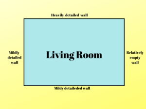
Maybe one object could be set on the wall like a mirror or painting. In real life, it is difficult to make one wall totally empty. The “emptiness” would be relative to the rest of the walls. Some examples of ‘empty” could be a window wall with draperies or a wall with one table and one painting.
The effect was a pleasurable path. The eye moved in a smooth, often circular fashion, seeking to close the circle (Law of Closure). Immediately, when one uses the theorem in a room, one’s eye travels in a circular manner. This way of decorating works like magic to calm the eye and invigorate the energy of a room. The room then becomes a safe haven, a womb of comfort and a place which can generate a feeling of well-being. It affects us not only on the basis of seeing but that of being.
If there was only one thing of the many ideas that I would want you to take from this book, it would be my adaptation of the old professor’s theorem from a scaffolding for a painting to a three dimensional way to decorate a room. It is a piece of decorating advice that does not cost money, can be utilized to affect change in a small abode and could take away the effects of clutter without throwing out a thing. Although it is not a finished decorating project, it is a way of organizing your space for positive Energy.
I have also used the theorem in a decluttering program. See my blog, Clutter Emergency? – How to Cope with the Stress
The Truth About Clutter
Note that when one works on the dominant wall, where more objects/fixations/clutter are present, we are reminded of the maxim “less is more.” “Less is more” is only a partial truth. “Less” makes it easier to arrange the scaffolding. Multiple artifacts are more challenging. The Energy we get is not based on less fixations but on their arrangement. The Old Professor’s Theorem helps to group more into less. There are other tricks:
Moving our objects to the cluttered wall is one wall to diminish clutter
Arranging like things close together makes several fixations into one. (Law of Proximity, Law of Similarity, The Gestault Laws of Perception, Lesson III.
Containing things on a tray corals many fixations into one. (Law of Common Region, Lesson III)
Using the Old Professor’s Theorem on Smaller Objects
In Feng Shui, the arrangement of a room’s plan is based on a bagua, a map showing where places in ones environment are connected to specific areas in ones life. Placement in the correct areas, improves chi . Some Feng Shui practitioners suggest that the bagua not only be used on the plan of the house but every visual surface. I agree that each diminutive of the larger, from the room layout, to the arrangements of a curio cabinet to the items on a desk, a table or shelf should be a replication of the larger. It does not have to be a replication, however, of the bagua, which doesn’t resonate with the Western mind. One substitute is the Old Professor’s Theorem. An easy rule for surfaces like your coffee table: Place no more than three items on a surface. Choose one dominant, usually in size and two subdominant items. Leave one part of the table empty
Changing Perspective Through Movement
One may ask what happens when we change position through movement. If we are looking at the dominant wall which has been gridded , a slight turn changes the scaffolding in our line of view. That is true; scaffolding changes as our vision changes as we move. Sometimes we are looking at two walls, or three walls, (if we include our peripheral vision.) When we do that, the gridding of one wall becomes distorted in our range of vision, e.g. the dominant object may no longer be in a quadrant as our field of vision changes.
To add to the problem, we have to understand that even though we live in a 3D world defined by 360 degrees, what we see in front of us is 180 degrees, which is like looking at a 2D picture with qualities of depth. Of that 180 degrees, we only see clearly in front of us, 60 of the 180 degrees, called the cone of vision. To the right and left of this cone is our peripheral vision. So our plane of vision to some extant is two- dimensional with a three- dimensional perception of depth, with the greatest focus in the middle. Then when we move, we see a completely different picture. The scaffolding changes, negating the scaffolding of the Old Professor’s Theorem .
Give this no worries. Deriving Energy from the environment is based not just on seeing but on being. Movement does not affect the value of these design effects because we also derive Energy by being near good patterns. See Finding Energy by Being Inside a Geometric Pattern, Lesson XIV
3. Circling the Square by Cutting Off Angles
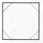
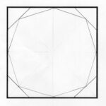
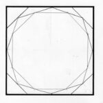
One way of creating a pleasurable dance for “the Eye” (the visual perception system acting in service to the subliminal self) is making the square appear closer to a circle (or rectangle closer to an oval). There are no straight lines in nature, except for a few crystals here and there. One way to create a more circular effect is to catty-corner furniture in the corners of a room. Each time we cut off an angle we start getting closer to a circle. Note how the square starts approximating a circle as we progressively cut of the corners.
Feng Shui hates corners too. It says that they trap stale energy which results in a lack of prosperity.
Using Furniture to Cut Angles in a Room
In a room, here is a way to round off the angle. Place furniture, like this couch, catty-cornered in the room, cutting off equal parts of the two walls making the corner.
In this manner “the Eye” sees the room as more organic. This is a method that decreases space, however, thus it is not considered functional. If you can’t give up that much space, you can place the furniture slightly askew, just subtle enough to add a hint of offsetting the square.
No doubt putting a piece of furniture against a corner “wastes” space. It does improve form however, creating more Energy. The trick is to find ways to utilize the space in the corner, which would then make form and function one. Placing a table with a lamp behind the couch eliminates wasted space but eliminates the glaring angle.
In the real world, you probably cannot have every corner roped off. I have an open plan living room, dining area and kitchen. With the hall, I have six corners. With doors, windows and a lack of space, I was only able to angle three of the six corners. One was the use of a large plant. That was enough, however, to give a circular movement.
\
4. Using the Gestalt Laws of Perception
Laws of Similarity and Good Continuation
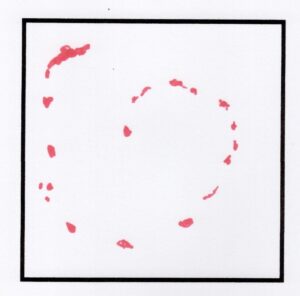
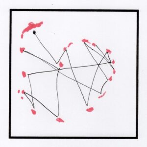
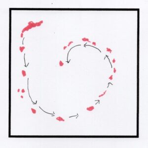
To enhance the movement of the eye traveling in a circular manner, consider using the Law of Similarity and Law of Good Continuation. (The Gestalt Laws of Perception, Lesson III.) Choose a similar fixation, be it color or texture and repeat it at intervals on or near the walls or in the middle of the room. A fixation can also be a group of objects. For example, a group of baskets is perceived as one form. Color, however, is the most used fixation to move the eye. The good news is that where ever you place these like color items, the brain will create a peaceful path because it goes along with the Gestalt Law of Continuation.
The brain’s use of the Law of Similarity doesn’t make the eye jump from one red item to the other like this:
Instead the brain’s use of the Law of Good Continuation makes the eye choose the smoothest path possible like this:
It is always good for one object to be larger than all the others to give the eye a place to start, also known as the focal point.
Laws of Good Continuation and Similarity to create a Circular Movement on a Wall
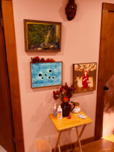
My acupuncturist’s husband always insisted on hanging pictures on studs. A circular look could not be achieved so we had to work around this. The top left picture’s colors did not go with the orange wall.
Just leaving that picture there was improved by adding some flowers on the frame to connect with the flowers in the vase.
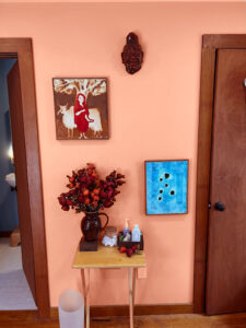
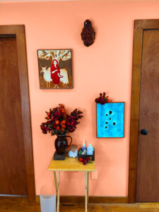
The big improvement came when the green picture was removed and we kept the colors of only orange and blue.
Just a few flowers on the blue painting pulled the eye further as a circle. The blue on its own would not have pulled the eye. It needed the red.
Color Choices to Move the Eye
Monotone
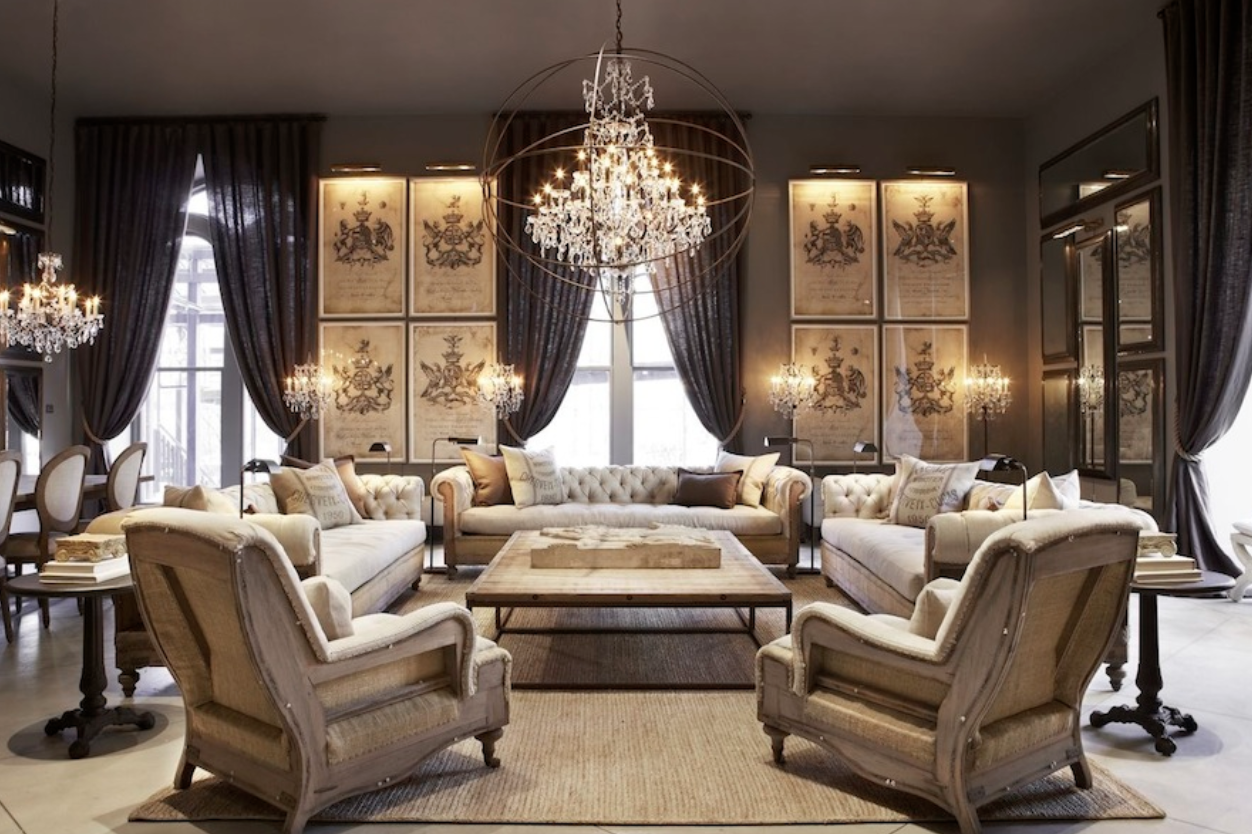
One of the easiest ways to decorate is to use a neutral monotone palette: browns, grays, black, taupe, brass and silver. It is quite a popular decorating style because it provides an extremely peaceful environment. The reason for that is there are few fixations to make the eye jump around. In fact, the room is one color, one fixation (yes there are many fixations as the perception system reads each object.) Yet, it doesn’t read that way. It is like a comforting womb, certainly not dull with the texture of brass, silver and wrought iron. Restoration Hardware uses this color scheme. The following pictures are examples. Although the items seem pricey, this color scheme can be done on any budget.
Yet………, the real world poses difficulty in starting over to achieve this monotone affect. First of all you might not like it, being a yellow-and-orange person. Also, to begin again in monotone you might have to throw out everything you have. Even if I had the means, I just couldn’t do it. Not because I am a hoarder but I don’t like waste. This book is not about starting over but working with what you have.
Color
We live in a small apartment. Within it, we have a mish-mosh of items from our first marriages, our deceased parents and an assortment of decorative gifts. Plus, we love to collect and do so without regard to the color scheme of our living space. There is no monotone here.
In the lives of most people, we can’t throw out everything and start over…nor should we. The best you can do is to approximate a monotone environment by negotiating your color choices. Remember, that even though color is known to have specific energetic effects, I am only using color as a fixation that can create a scaffolding.
- I could ask you to determine your favorite color. That won’t be difficult because most of what you have bought for your domicile will be in that color.
- Determine its complement. A color wheel will help to some extent.
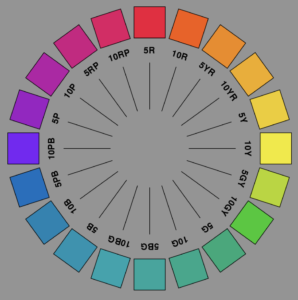 My favorite color is green, therefore its complement is red. The greens I use in my space however, are not the greens on the color wheel, like the green of the emerald city but more subdued variations, like the color of a sage leaf, army green or the color of a beautiful pine. The complement of emerald green is Christmas red, which are not the true complements of my greens. They are brick red, barn red, cranberry red, burgundy and perhaps a touch of persimmon.
Now try to get as many items that you own with your primary palette and about a third in its complementary color. Focus on that. Here is the hard emotional part. Get rid of the colors, which do not fit into this combination of colors. All the neutral browns and blacks and grays can stay but if your palette is a type of blue and orange, the lime vase has to move. Maybe it has to move to the bathroom or bedroom where a new palette exists, but it has to move. Some alternatives are to paint frames and chairs, do minor upholstery, get new curtains and shades or just get rid of the refrigerator magnets.
Complementary Colors
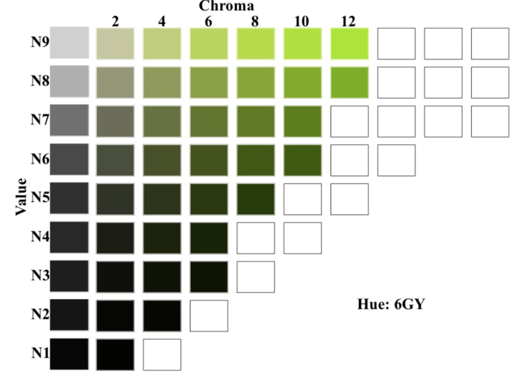
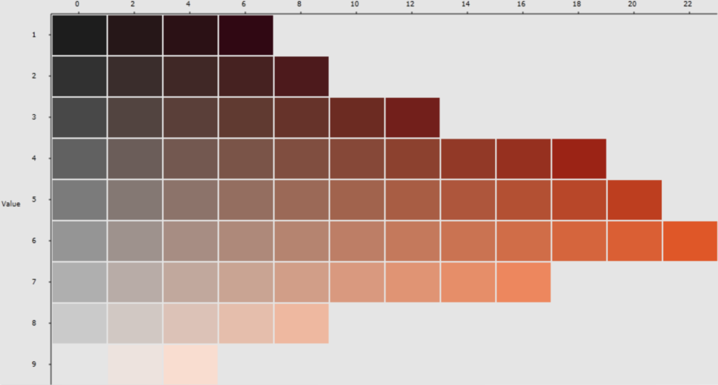
You could use a color wheel to approximate your color but the color wheel is limited. You only see 9-12 colors (hues) in pure color (chroma). Most colors in decorating are pure color mixed with black and white (value). A lot of colors have to be extrapolated from the color wheel. A lovely color missing from the wheel is heather pink, a red-purple mixture with a hint of black and lots of white. If you could approximate your choice color on the color wheel you could find its opposite. Then, whatever the white and black that is used, take your approximated color from the wheel, add it to the complement from the wheel. This is hard for the untrained eye to do.
My greens are 2/3 green with 1/3 yellow (between green and yellow-green =hue) and varying degrees of black and white. The compliment of my greens are the opposite of the color wheel: 2/3 red with 1/3 purple (between red and purple-red on the color wheel = hue) and varying degrees of black and white.
Another way of figuring out your complement is to go to a paint store and grab every chip that seems to be your chosen color. Go home and match the chips until you find your chosen color. Go back to the paint store and, if they have a designer in house, ask them to select the complimentary color chip.
Last of all, you can use Mrs. Blanding’s way. Here is a table of more muted complementary colors applicable for decorating. If you are in need of the brighter hues, the color wheel will work just fine.
Transitions Through Chaos Theory
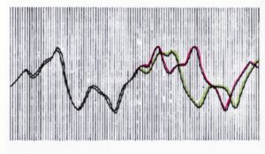
Most people are familiar with the term of chaos mathematics, the Butterfly Effect: a small movement creates a large effect. Sometimes the slight change increases incrementally in small steps before exploding into the larger effect. Not as well know in this concept is the fact that sometimes, when the small changes occur, they go back on themselves, revealing the original pre-change state. You can see this in Arthur Lorenz’s graph where the Butterfly Effect on weather was first discovered. Lorenz was inputing numbers into computer to learn bout weather patterns. Normally, he typed in six decimal places. To save time and get a faster printout he rounded off the decimals to three places thinking it would bring the same result. Instead of .506127, he inputed .506.
Once I was knitting a blanket of many colors. To keep the pattern in its natural state, I had to transition the colors. I started with red and green in rows, then added one small purple row, then back to red and green, then introduced two purple rows, then some red and green and eventually dropped the red until I was doing just purple and green. Then, I introduced another color leaving green behind. I didn’t realize at the time that I was using chaos theory in creating this design.
Sometimes circling the square might need a different type of transition. One wall may be brick, painted a different color or be the clutter wall displaying your treasured green pottery. That one wall may be out of sync color wise with the other three. Transition that wall by using some of that color on the two adjoining walls. If you have a brick wall, place some terra cotta pottery on the two adjoining walls. If you paint one wall, midnight blue, place some similar colored pillows on the sofa of the adjoining wall and a painting using that blue on the other adjoining wall. You could also address the fourth wall with the same coloring, which then evokes the Law of Similarity.
An Example of Using Chaos Theory to Move the Eye Throughout the Room
I have a beautiful set of vintage chrome barware. This is the only place in my apartment that I have chrome so it is difficult to have this silver look connect with the rest of the items in the room, thus keeping the eye from flowing in a circle. I was able to accomplish this by adding an antique brass seltzer bottle to the grouping. Also I saw the red bakelite handle on one of the shakers as potential to connect to the rest of the room.
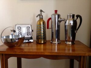 Immediately, the red handle on the shaker connected to the same color as the red lips on the Buddha and the hanging red bakelite beads.
You can see that the brass color of the shaker connects to the color of the Buddha’s face and the picture frames and continue to circle the room. Adding the brass seltzer bottle is similar to how Chaos theory works.
Sometimes, we need ore than one object. Remember I said that you couldn’t use your chartreuse vase in your orange and blue room. With chaos theory, you could by introducing small amounts of chartreuse back and forth.
Look at the placement of red objects in the room: Just a few flowers on the blue painting pulled the eye further as a circle. The blue on its own would not have pulled the eye. It needed the red.
An Aside
Paige Rense, the Editor-in Chief of Architectural Digest, said that, “…think you can decorate? You probably can’t. Think you have great taste? You probably don’t. Think you have style?” ”…let the decorator do it. They have created hundreds… of rooms. How many have you done? They can do it better.”
(after March 6 2009)
She might be right since expertise and experience do prove themselves. There are a lot of problems, however, with her statement:
- I am sticking my neck out writing a design book going against the bible of design but, in my opinion, some of the rooms created in Architectural Digest have been so filled with objects of status projection (ego symbolism) that the scaffolding is gone. They are not restful rooms
- Not everyone can afford a designer, certainly not a school in the South Bronx, or middle class families or institutions where funds are limited and designated for services to others (police stations, post offices, hospitals and other institutional buildings) Design and beauty are a birthright for everyone
- If one is lucky enough to have a designer, one still must visit places outside the home. Design should not just be relegated to your home or a museum but all the places that you and your community cast their eyes. Lack of good design affects you.
- Even if one could afford a designer, the designer eventually goes home. Immediately, the scaffolding gets affected. It is all the things that you want to do, be it bring out granny’s afghan or pile up the magazines and newspapers (a small event, but the beginnings of a growing one) that informs the scaffolding.
- Design is not just a one time deal, repeated every couple of years; it is a daily activity. Awareness is one of the keys to maintain the scaffolding.
.
Start with Eye movements for perception – extrapolate for eye movements for soul.
Reviewing the basic tools, we find that:
- Our visual perception groups parts into larger units so that we make sense of our visual world. The eye travels along a set of limited fixations to arrive at an object. That object, in turn, becomes a fixation to another group of objects.
- The human perceptual system attempts to see every stimulus pattern as simple as possible. (Law of Pragranz, i.e. Simplicity)
- The human perception system tends to group similar things as one unit. (Law of Similarity)
- The human perceptual system is stressed by complications, a lack of connection, and a jagged path. The human perception system seeks the simplest path. (Law of Good Continuation).
- The human perception system groups things which are near each other and perceives them as one unit, translating fixations into objects (or details into forms) (Law of Proximity.)
- The human perception system automatically brings closure to an object even though all the sensations may not be there, usually closing it to an object that is simple and pleasing to the subliminal self. (Law of Closure)
- A good designer aligns decorative focal objects (ornaments) in the process of creating form, using the Gestalt Laws of Perception to engage the eye to travel in a pleasing scaffolding.
- Perception can be affected by our thinking; what we see may be cognitively overridden by the mind. The designer needs to be aware of that since what we see affects us, even if it does not come into our awareness.
- We have to be careful not to excessive symbols. Even if they have a specific meaning for us, they are fixations or a combination of many fixations. Symbols need to be arranged in a pattern. Patterns in turn become subliminal symbols that bring energy to the human persona.
- The presence of clutter or excessive fixations is a detriment to a pleasurable dance for the eye. Often, clutter and excessive materialism is the result of the spirit –matter split.
- Actually, you design everyday…just by moving a few objects around. Design is everywhere. To design for the purpose of aiding life, creating energy, however, takes some thinking. Good design starts in the mind, a mind that knows itself and its historical evolution.
- There are an infinite amount of mathematical scaffoldings that bring subtle energy because they are within the descriptions of nature. There are many types of scaffolding that are without a basis in nature and these will deplete subtle energy. There is a limit to what we can create but within that limit there are infinite possibilities. To create something beautiful, the designer must respect that beauty is not in the eye of the beholder but an absolute principle not open to interpretation. Tastes are infinite and can be within the limits of the scaffolding of beauty or outside.
- The simplest scaffolding that corresponds to nature is a circle (or oval).
[1] It is preferable that the dominant item be in one of the bottom quadrants to “ground the picture.”
[2] Feng Shui has a similar disdain for the corners of the square or rectangle . According to that tradition, corners trap energy, resulting in stagnation. Its solutions are diversionary methods of moving qi like the placement of fountains, chimes and plants. Mine are more Western, i.e. geometrical, although if a plant were big enough, it could be used to round off a corner.
[3] Lorenz diagram.
