Metaphysical decorating is decorating that radiates energy. Most of that energy comes from our subliminally recognizing the patterns in nature. Unfortunately, the modern age has replaced those natural visual patterns with symbols. Without natural patterns, our decorating is lifeless to us. To create an energetic living space, we must understand how to use more natural visual patterns rather than so many symbols. In this lesson, the first of five parts, Patterns and Symbols in Decorating, Lesson VII, Part A, we begin to look at this process.
What are Symbols?
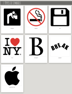
Symbols are part of a verbal or visual language we use to find our way in the world. Some symbols, correspond simply with one idea.
Other symbols, like the ancient symbol of labyrinths, have subtle, complex layers of meaning. The labyrinth represents a journey to find one’s authentic self — while “journey and “authentic self” are deeply layered ideas.
The horizontal line of the ancient cross symbol represents an intersection of the earthly world, and its vertical line the heavenly and shadow world. On the human body, the intersection would be at the heart.
What are Patterns ?
Nature is full of patterns. They are nature’s geometric structure, its scaffolding. We recognize those natural patterns often subliminally, ethereally. It is not at all like we recognize symbols.
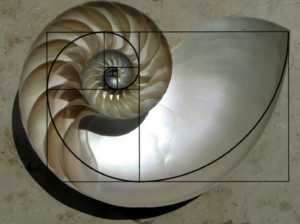
Fibonacci Pattern
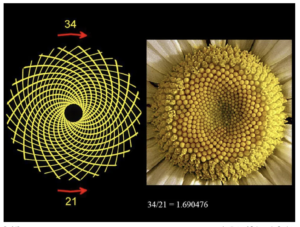
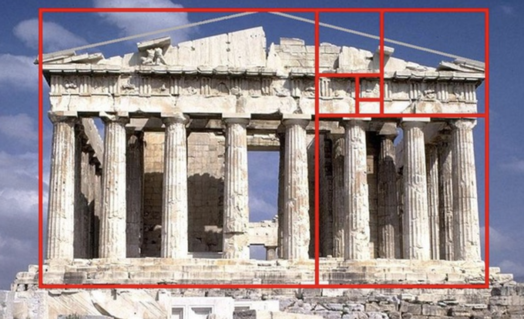
Golden Ratio Patterns
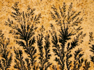
Fractal Patterns
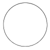
Geometric Patterns
Architectural design is an easy place to notice the contrast and interplay of symbol and natural pattern.
Three buildings as symbols:
- The Great Pyramid of Khufu’s natural, unyielding pyramidal pattern works on us subliminally as it also symbolizes an unyielding connection between the earthly and divine realms, between life and an afterlife.
- The United Nations Secretariat Building’s natural unyielding quadrilateral pattern also stands as a symbol of international unity, hope, and peace.
- The architect of the World Trade Center, Minoru Yamasaki, saw the Twin Towers as a symbol of peace. They stood as a symbol of America’s economic power, prosperity, globalization, and capitalism. Osama Bin Laden saw it, too, the reason he attacked it. Today, we retranslate the vanished Twin Towers as a symbol of America’s vulnerability and loss.
Three buildings and the search for their patterns:
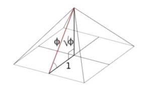
- The Great Pyramid of Khufu is based on a natural pattern. If half the width of the base is 1, the slant of the height would be 1.61803399… symbolized by Φ, also known as phi. The ratio of 1 to phi is known as the Golden Ratio. For further explanation on phi, see the blog, Understanding the Golden Proportion.
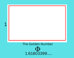
- There is similar math pattern in the United Nations Secretariat Building. One of the designers was La Corbusier who used the Golden Ratio in all his work. He piled three Golden rectangles (rectangles with the ratio of width to length as 1 to 1.16183) to create the towering building.The height of the building is also 1.618 times the width.
- From my understanding, there was no pattern based on nature connected to the World Trade Towers. People delighted in observing the city from the top floor, but the buildings seem to have little energy. Before 9/11, New Yorkers dismissively called them just boxes, the boxes in which the Empire State Building and Chrysler Building came.
The Role of the Ego on Visual Perception
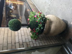
A woman from the neighborhood approached me as I was planting flowers in front of our NYC co-op one day. She used to do the planting in front of her own building and loved my gardens, she told me. But, she added, the building’s gardening committee dismissed her when she planted morning glories. They were too “country,” too unsophisticated for the committee. It went on to plant boxwood shrubs, though shallow-rooted boxwoods do poorly in window boxes and freezing winter winds.
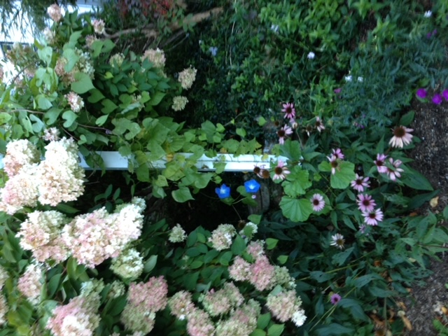
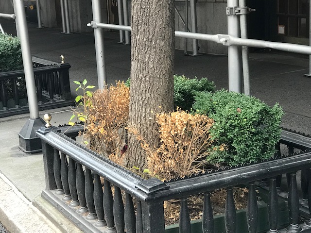
“Does living with dead brown balls in the window say expensive co-op?” she cried with agitation.
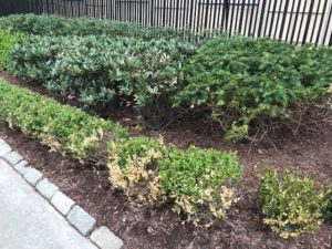
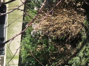
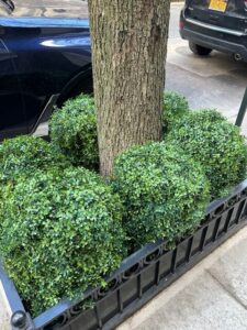
I wondered why boxwoods were popping up in tony New York City neighborhoods over the last decade. They were often planted in tree beds where the dominant tree shade also sucked the life out of them. They were looking sparse and misshapen. Yet, I heard over and over, “Oh, but we have boxwoods.” The city seems hypnotized. Boxwoods are expensive, a neighborhood building superintendent told me, so he warned the guards to watch for thievery. Who, I said to myself, would steal these half-dead bushes?
That’s when I realized the ego’s power over a symbol. Even as a gnarly plant in a tree bed or a mass of brown balls, the boxwood symbolized prestige. This illustrates one of the most important decorating problems: Ego-driven symbols were drowning natural patterns.
As symbols, plants are mostly part of the past. Red roses still mean love, mistletoe is permission to own a kiss, and the red poppy is remembrance. But most such symbols died out in the 19th century.
At some point, boxwoods became a symbol, an ugly distortion. My neighbor and I, somehow oblivious, couldn’t understand why “dead brown balls” could replace sweet little morning glories. So, what exalts them? They are sublime in the gardens of mansions. Versailles is an example; homes in the Hamptons are another. Boxwoods’ density makes them easy to sculpt into topiaries and geometric forms. Their various leaf patterns are naturally beautiful. We yearn for such beauty, but we also want to associate ourselves with the symbols of majesty.
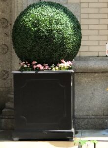
Worse than the twisted, dying bushes, people began to install plants of plastic, with plastic’s past and future’s effect depleting the planet’s energy. (See Lesson XII, Our Relationship and the World.)
The Role of the Ego on Visual Perception
How the Ego Can Change a Pattern to Symbol
Today’s tendency to base design on symbols rather than natural patterns grew from the mid-19th century. The architect Jonathan Hale in The Old Way of Seeing (1994) looked longingly at early Western architecture. It was magically alive and powerful. When architects looked at a building, they saw natural patterns. They let those natural patterns guide them. They could “make forms of rich complexity,” Hale wrote. Then, their forms “began to dance.”
Design today has jaded us and our joy. In vain, our spirit searches for natural patterns, the kind we can see in the small leaves of flourishing boxwood sand all around us in the trees, birds, and so much else in nature, including our own life forms.
Hale writes, that in America, we don’t encourage vision.” ” We have methodologies for creating the sense of home, the sense of community. But the harder we try, the less we hear the old laughter.”
The loss of the old way of seeing happened almost overnight about two centuries ago, Hale writes. The Second Bank of the United States in Philadelphia started the Greek Revival movement in the 1830s. Architects began replacing natural patterns with symbols. Seeking a sense of greatness and power to bolster America’s sagging self-image, they turned to ancient Greek design. The style spread like invasive plants across the country
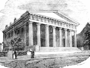
At first, the designs were true to the ancient Greek designs. Aiming to please the human mind and spirit, the architects used the beautiful geometric patterns and proportions of nature to guide them. Aiming to please the American ego, however, the Greek Revival architects started overlooking what made the Greek temple powerful. They slapped their columns, friezes, pediments, and other Greek-like architectural articulations onto their structures. Their “symbol-seeing” egos might have convinced themselves, the bankers, and many others that those symbolic building shapes were grand. To the culture, however, the magic was lost.
The Greeks based their patterns on nature, particularly the proportions of the human body. We call those proportions the Golden Mean. It made Greek architecture alive and therefore powerful.
Why We Have to Understand Symbols and Patterns in Design
Good professional designers cultivate their eye to see the scaffolding, the natural patterns. What they see is subtle, however. Design magazines show us bytes of information but don’t expect us to see whole picture. Without seeing the patterns, our design work, not to mention our personal experience, is flat, vacant, powerless.
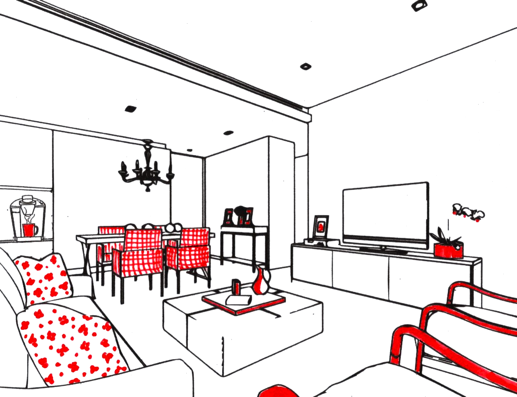
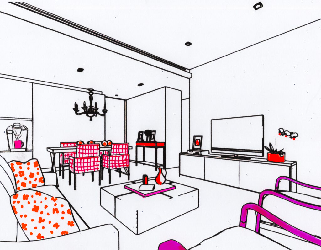
For instance, flipping through a design magazine, we see a room punctuated interestingly with red-patterned objects. Our mind’s eye overlooks the objects’ redness pattern and sees, instead, their redness as symbols. Wishing to capture for ourselves the room’s interest, we search for objects of symbolic red rather than patterned red. Since the redness symbol has an indistinct range of shades and tones — including, God forbid, a very purplish fuchsia — we assemble in a room several out-of-whack colored objects. We satisfy ourselves with their varied reddishness but miss our design’s lifelessness.
As you learned in The Gestalt Laws in Perception, Lesson V about the Law of Similarity, the brain fixates on all like things. The same reds, placed in a careful manner will cause the eye to focus on one after another, creating a sense of harmonious subliminal blueprints. When the reds differ, we see wild, discordant scaffolding. They are like a three-year-old playing on an Etch-a-Sketch.
The subliminal pattern I always choose to use in decorating is a circle. Like the golden ratio, it is also a natural pattern but less complicated. Among sacred geometry symbols, the circle is among the noblest. The eye perceives energy as it moves in a circle from item to item. You live inside the energy of a mandala.
I should point out that nothing is wrong with symbols in design, ego-bound or otherwise. They must not disembowel a good pattern, however. Some symbols could be family photos or heirloom treasures. Some could be designer-brand items for a living space. Harmonious patterns, however, must be inherent in their design; they must be arranged to create nature-based patterns.
Some symbols can even border on the ridiculous. The paleontologist Henry Galiano, when consulting on Guerney’s auction featuring dinosaur fossils, had issues with symbol decorating. “You’d be surprised how many people these days want dinosaur fossils to match the color of their drapes or just serve as monuments to their Raging egos,” he exclaimed with some ire.
Actually, indicating that the bones had to match the drapes is a good sign. If the fossil’s color is repeated in a harmonious pattern, then the goal of metaphysical decorating for energy has been met.
I admit that in my New York City gardening project, I did use some boxwood bushes. I planted them in pots, pruning them constantly. As a pair, they flanked our building’s entrance. Sure, they are symbols, but as a symmetrical pair, their pattern has spirit.
In Patterns and Symbols in Decorating, Lesson VII, Part D, we will look at all these symbols used in design from photos to fossils and find ways to display them in a way that enhances natural patterns.
For now, in Patterns and Symbols in Decorating, Lesson VII, Part B, we will continue to look at color, since it is the most used of all the decorating elements and most responsible for the eye creating patterns.
***
There are two parts to this website, The Lessons, which are more difficult in concept, and the blogs, which are lighter in nature. A blog that you might enjoy with the same theme as Patterns and Symbols in Decorating, Lesson VII, Part A is:
A lesson that relates to this lesson is:
Please note that my website allows you to leave comments at the end of the blogs but not at the end of each lesson. If you have a comment or question about a lesson, you may email me at ruta@rutas-rules.com
