Unavoidable Plastic
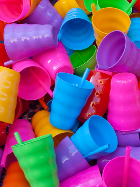
I hate that we must live with unavoidable plastic. I hate the look of plastic and hate being near it.
Through the metaphysics behind decorating, I concentrate not only on the subtle energy generated through seeing objects. I also look at the relationships with the objects around us. To me, plastic is not only ugly: it lacks life.
Now, wood and metal have a guaranteed mortality, much like us. In the same paradoxical wabi-sabi fashion, we both will age into the beauty of imperfection. Plastic, on the other hand, is almost immortal.
It lives for over 1,000 years in landfills and our waters, intact or disintegrated into microplastic. These will eventually degrade into nanoparticles incorporated into animal tissue, becoming part of the food chain.
I don’t deny that plastic has had some life saving uses in medicine. Who could challenge its protective functions in child car seats or bike helmets? I must also confess I still love plastic bags and containers to store food. I continue to challenge myself every day to find alternatives but I am no saint in the matter. [1]
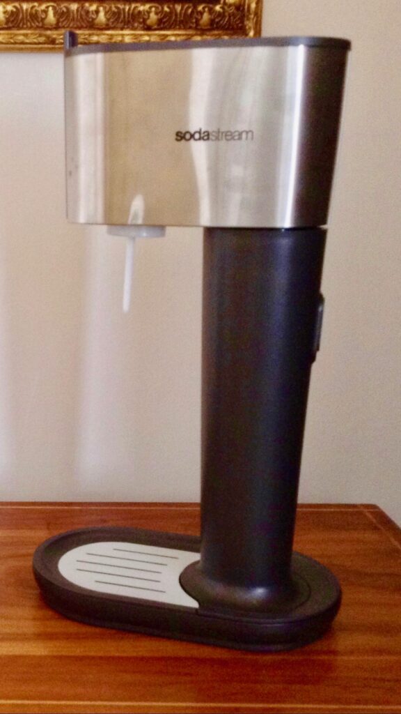 Those plastic items in my home are hidden, however, to never offend me by finding them in my décor. That is, until the day my friend gave us a SodaStream to satisfy our seltzer addiction.
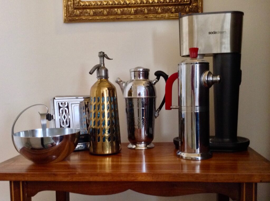
Despite being mostly plastic, the device has redeeming social value by eliminating hundreds of plastic bottles a year. I won’t concentrate on how I feel about being near the material. I will just address some of my concerns on its appearance.
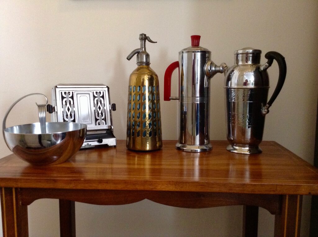
Although I thought it belonged in a cupboard, like other useful plastic items, my husband disagreed. Rummaging through a cabinet and hauling it onto a workable surface every time we wanted a seltzer was problematic. My husband argued, we would never use it. He had a point. The kitchen counter was out. No room there. My husband suggested putting it on the Art Deco side table [2] where I display my collection of vintage chrome barware. Now, he was somewhat right. It’s handy there and similar in function to the other items, but aesthetically? No.
Seeing and Design
When I concentrate on the “seeing” part of my decorating work, as I am now doing with the SodaStream, I examine how the brain works visually.. Because it is always on overload, the brain will look for certain configurations to make its job easier, known as the Gestalt Laws of Perception.
I try to arrange things based on eye movements. When the eye moves to glean information, it creates an energizing pattern, a blueprint akin to the scaffoldings found in nature.
The reason I grouped all the chrome barware together is based both on the law of proximity and the law of similarity. If we group items near each other, particularly if they are similar in color, texture or size, the brain relaxes. It sees the collection as one unit. This can put less stress on the visual perception system. This principle is very handy, especially when it allows us to display a whole lot of stuff without a cluttered appearance.
Another good principle in the law of similarity is that the eye will move to find like things. I place similar objects of color, texture and height throughout a room to get the eye to move in a circular manner, a natural pattern that is both calming and energizing to the human persona.
We can also use this law to give a room a sense of coherence. For instance, if most of the furniture is dark wood but with an added side table of blonde wood, it’s going to look like a mistake. But introducing a second or third item made of blonde wood—say a picture frame or a tray—makes the blonde furnishings more intentional.
Working with the Eye and Color
One problem with my chrome ware was that there were no other items made of chrome in the room, not inviting the eye to move in any pleasurable direction. I solved this problem by adding a brass seltzer bottle to the group. An antique gold frame is above the collection andbrass/old-gold objects are all over the room, so putting one on the Deco table visually connected the chrome grouping with other brass/old gold elements there.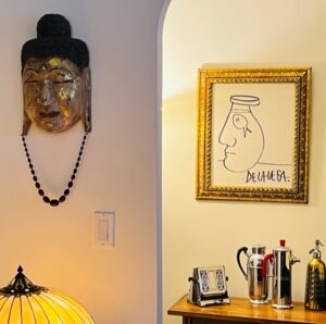
One of the chrome cocktail shakers has red Bakelite [3] handles. A string of red Bakelite beads draped around a Buddha statue near the barware collection is another subtle repetition, which pulls the eye to it. The Buddha’s brassy gold patina starts the path to get the eye to travel in a pleasing circular pattern in the living room.[4]
Still, the issue with the SodaStream remained.
Changing the Look of Plastic
I decided that the only way it could stand with the chrome barware was to make it Deco, so I found a Deco doorplate and a dented chrome shaker that might fit around the black tube part of the machine. I still don’t know what I will do, especially with the base and the upper part, but they are a work in progress. Of course, I could use a technique to make the plastic look like metal, which I have been able to do successfully several times, mostly for toys.
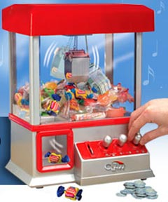
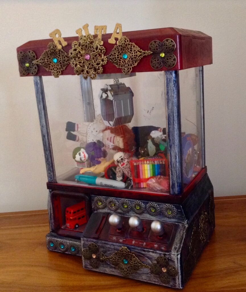
Knowing that I collected toys, someone gave me a claw machine as a gift, and here is what it looked like in the beginning:
Though it is a great toy and I loved it immediately, I didn’t love its plastic-ness. Most of my toys are older and made of iron or tin, an interesting patina, and I wanted the claw machine to look more like them (check out my robot collection if you haven’t seen it yet).
So… First I sanded all the colored plastic in a circular motion. Then I took some watered down Payne’s Gray acrylic paint, applied it where I had sanded in the same circular motion, and wiped off the excess. After the paint was dry, I glued on some inexpensive brass ornaments and colored crystals from a bead store. The glue I used was called Quick Grip, available in some craft stores or on the Internet. One alternative would be the more liquid version of crazy glue, but don’t get glue on top of the crystal or it will look milky.
Voila! So now I will try to figure out how to make the SodaStream look natural on the Deco table. I’ll keep you posted.
***
[1]I recently started using Mason jars, whose original designs have been expanded. The new wide mouth 500 ml jars are perfect substitutes for the plastic deli containers, and the metal tops make the jars spill proof.
[2]My father made this table in high school when every guy went to shop class. The design reflects the era.
[3]Bakelite(or polyoxybenzylmethylenglycolanhydride) is also a plastic – the first one made in 1907. For some reason, I love Bakelite despite my hate for its more modern cousins. Maybe it is because Bakelite was created without noxious chemical toxins, or because Bakelite is highly collectible and never finds its way into the landfill. It just has a lovely look and feel.
[4]The introduction of the brass seltzer bottle and the red Bakelite to create movement is similar to the butterfly effect, as defined in Chaos theory. The subliminal recognition of this natural pattern energizes the human persona.
***
There are two parts to this website, The Lessons, which are more difficult in concept, and the blogs, which are lighter in nature.
A Lesson that relates to this blog is
XII. Our Relationship to Objects and the World
Please note that my website allows you to leave comments at the end of the blogs but not at the end of each lesson. If you have a comment or question about a lesson, you may email me at ruta@rutas-rules.com
***
Ny favorite book on recycling is Garbageland. Written by Elizabeth Royte, the chapter on plastic is referred to as the The Devil’s Resin. Need one say more.
